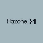
Exploring Harone’s Branding by VASK Studio
Venezuelan design studio VASK showcases their expertise in branding with their creation of an edgy brand identity for Harone, a premium real estate company emphasizing sustainability. Collaborating closely with the client, VASK aimed to craft a logo that not only reflects the company’s values but also exudes a sharp and futuristic aesthetic.
Crafting the Identity
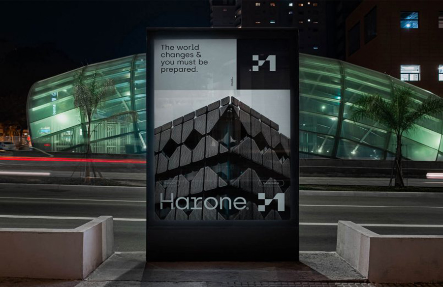
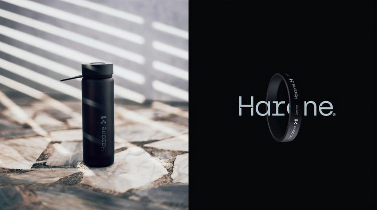
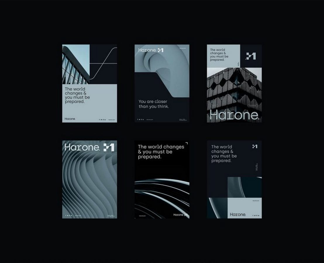
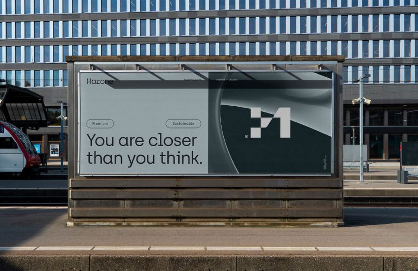
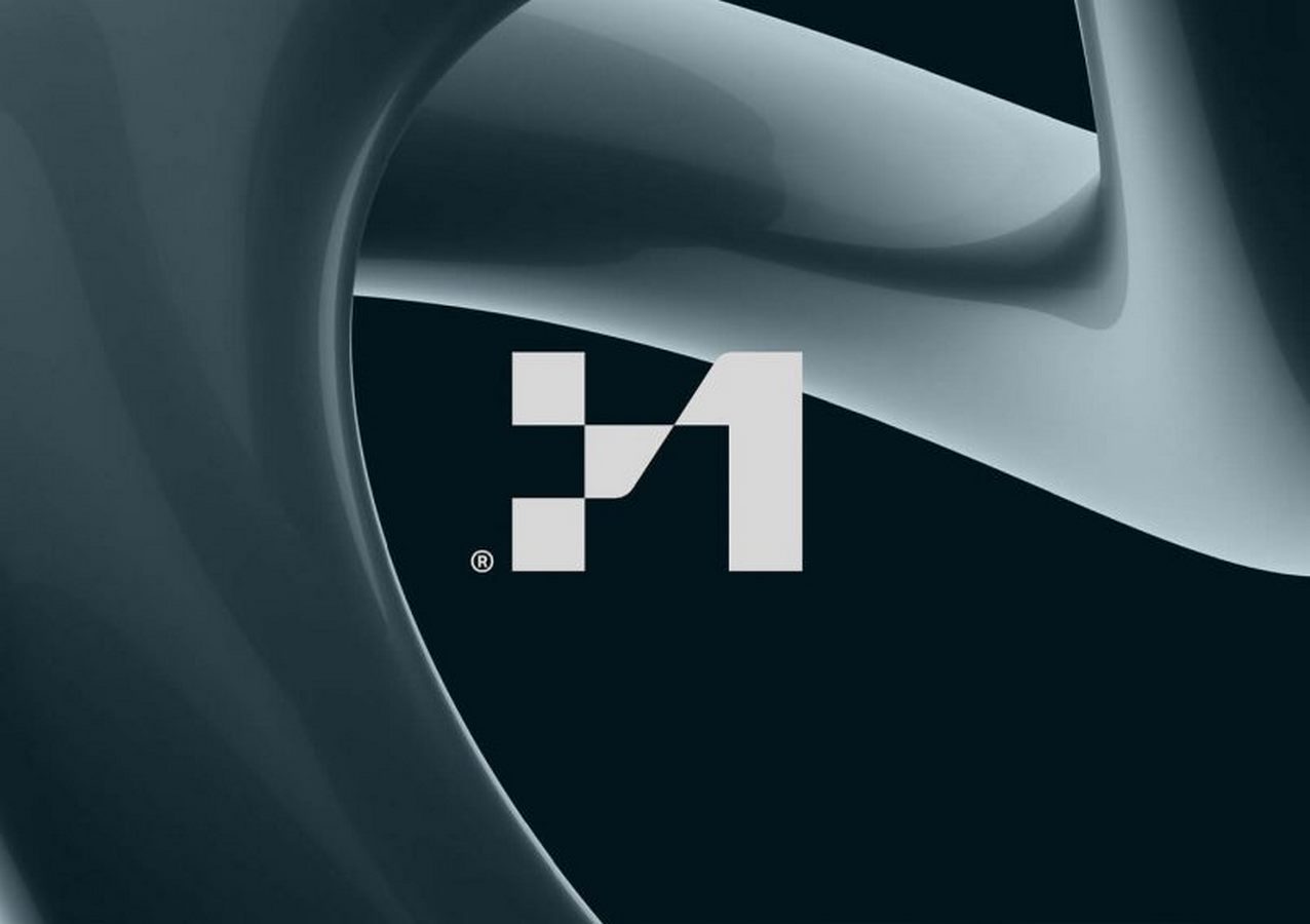
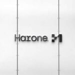
At the core of Harone’s branding is a minimalist symbol, meticulously designed to represent the essence of the company. The symbol, derived from the initials ‘H1’ (short for HarOne), embodies the bold and forward-thinking nature of the brand. Its simplicity and modernity make a powerful statement, signaling Harone’s commitment to innovation and progress in the real estate industry.
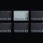
Custom Typography and Elegance
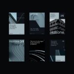
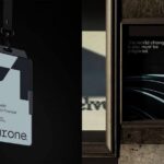
In addition to the distinctive logo, VASK employs custom typography across all brand materials, further reinforcing Harone’s dedication to excellence and sophistication. The carefully selected fonts not only enhance readability but also contribute to the overall visual appeal of the brand. By incorporating unique typography, Harone’s identity exudes elegance and professionalism, setting them apart in the competitive real estate market.
Sustainability and Vision
Beyond aesthetics, Harone’s branding reflects their core values, particularly their emphasis on sustainability and forward-looking vision. Through their collaboration with VASK Studio, Harone seeks to position itself as a leader in eco-conscious real estate, catering to discerning clients who prioritize environmental responsibility. The brand’s identity serves as a visual representation of their commitment to building a sustainable future while maintaining a modern and stylish image.
Conclusion: A Visionary Brand Identity
In conclusion, VASK Studio’s branding for Harone exemplifies creativity, vision, and strategic thinking. By crafting a logo and brand materials that embody the essence of the company, VASK has successfully captured Harone’s values and aspirations. With its minimalist design, custom typography, and focus on sustainability, Harone’s brand identity stands as a testament to their commitment to excellence and innovation in the real estate industry. As Harone continues to grow and evolve, its brand identity will serve as a powerful symbol of its unique identity and vision for the future.


Leave a reply


ArchiDome is envisioned as a comprehensive online platform dedicated to the world of architecture. It aims to be a hub for architects, designers, students, and enthusiasts, providing them with resources, inspiration, and a community for interaction and collaboration.