Highsnobiety – Unter den Linden: The Shell by VAUST Studio
A Dynamic Fusion of Creative Approaches
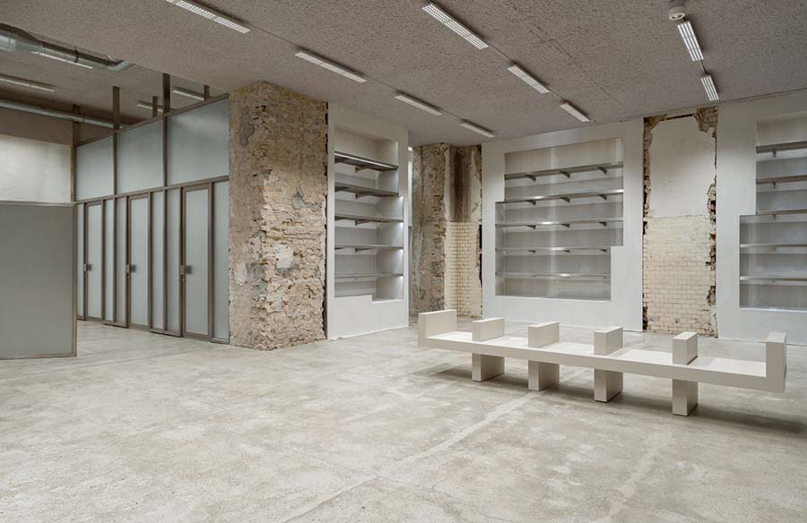
Highsnobiety’s “The Shell,” designed by VAUST Studio, emerges from a blend of diverse creative visions, functional requirements, and spatial dynamics. This space transcends traditional retail, evolving into a dynamic platform for layered and ever-changing storytelling.
A Spatial Narrative
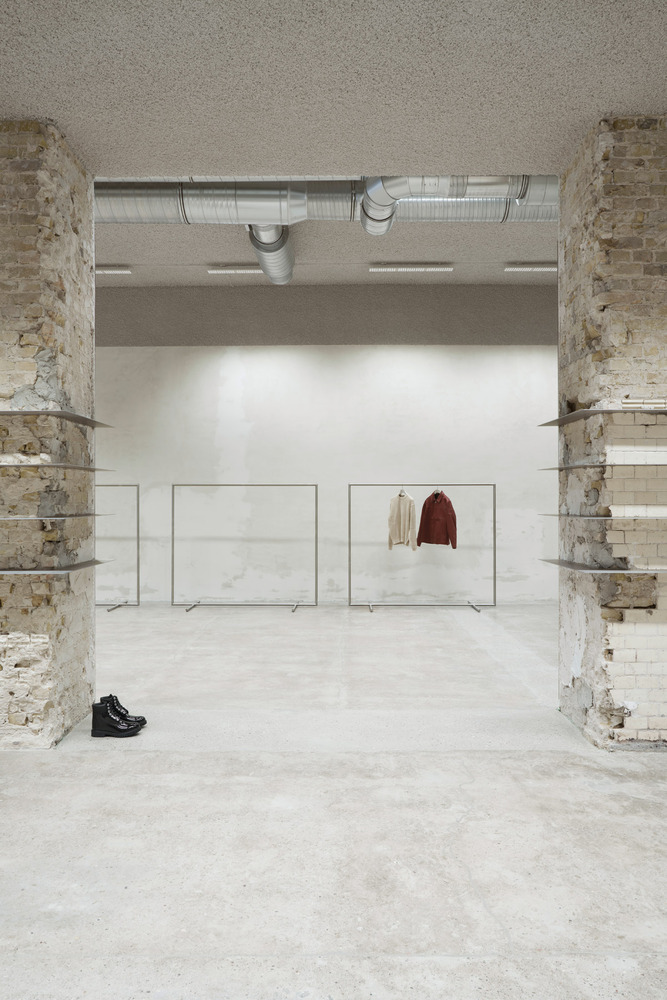
“The Shell” serves as a spatial narrative, moving beyond conventional shop design. It reflects tales of honesty, authenticity, and Berlin’s raw essence, embodying Highsnobiety’s contemporary flagship vision. The space is vibrant and dynamic, constantly evolving to feature cutting-edge brand installations. More than just a display and sales area, “The Shell” interacts with visitors, sharing unique stories.
Four-Layer Design Approach
VAUST Studio’s interior design unfolds in four distinct layers:
- First Layer: This layer preserves the rough surface of the building’s skeleton, enhanced with detailed artistic finishes.
- Second Layer: Permanent installations are integrated into the first layer, showcasing Highsnobiety’s core collections and accessories.
- Third Layer: Artistic spatial interventions serve as functional retail furniture, defining Highsnobiety Space’s visual aesthetic and language, blending with a generic “under construction” feel.
- Fourth Layer: Aligning with the third layer, this layer offers brand partnerships the freedom to create visually striking temporary setups within the Highsnobiety Cosmos.
Contrasting Themes
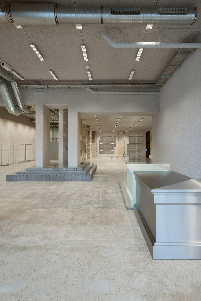
The design contrasts old and new luxury, exploring themes such as roughness vs. sleekness and heritage vs. modernity. Industrial materials are repurposed for a contemporary luxury context while preserving the building’s history. Existing architectural elements remain intact, creating a dialogue between past and present.
Blending Classical and Contemporary
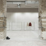
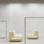
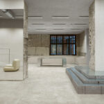
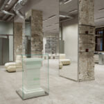
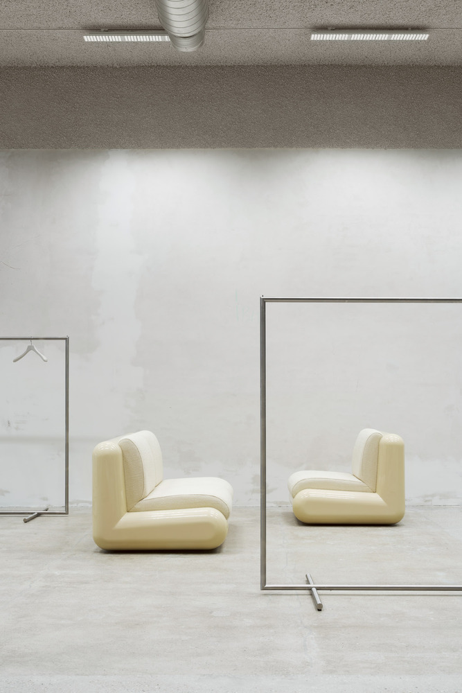
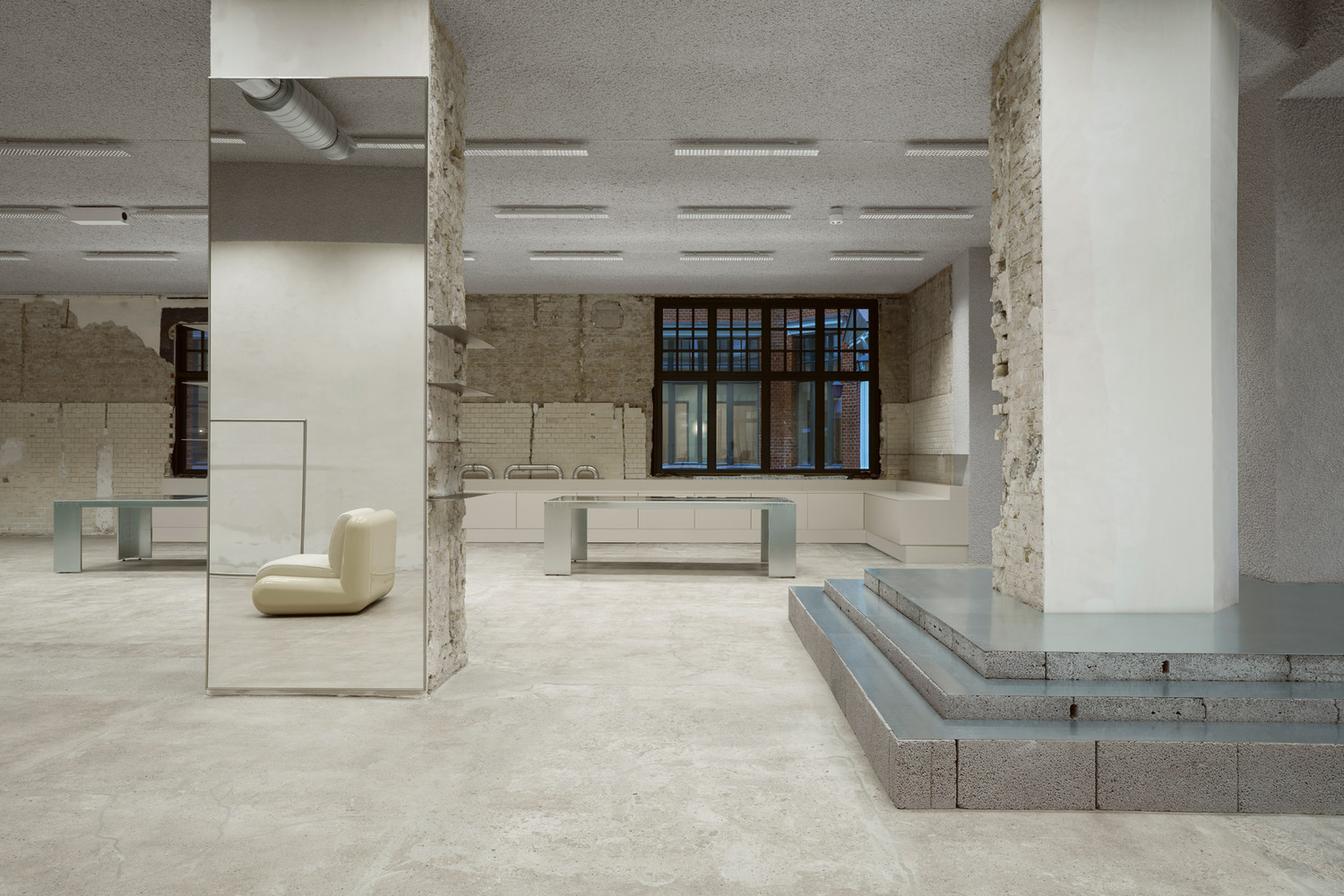
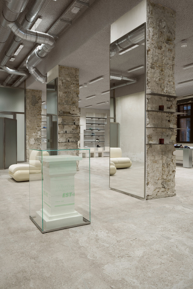
Furniture pieces blend classical aesthetics with contemporary materials, resulting in captivating architectural elements. For instance, classical column moldings are applied to industrial styrofoam, creating an unexpected contrast. The design preserves the heritage of the existing architecture, paying homage to Berlin through floors, walls, and raw brick columns.
Captivating Atmosphere
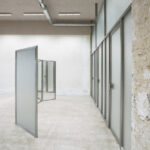
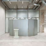
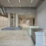
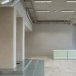
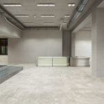
The space features a sanded concrete floor, warm grey sprayed ceiling, and rough columns and walls that tell the building’s story. These are contrasted by sleek interventions, such as stainless steel shelves embedded in the walls. An ERCO lighting concept enhances the atmosphere, while the checkout area juxtaposes contemporary materials like wired glass, polystyrene, and stainless steel. A stainless steel paravent with wired glass and mirrors conceals changing rooms, adding a touch of voyeurism with wired glass partitions.
The result is a captivating and dynamic space that not only reflects Highsnobiety’s refined vision but also engages visitors in an ever-evolving narrative.

